10 Things to Double-Check in Your IPPA Entries
Jun 06, 2025
⚠️ Warning! This is a long blog post, but it might just be the most important one you read relating to the IPPA.
When our judges are assessing your awards entries, there's a bunch of no-brainer faults that will result in your entry not scoring as high as it potentially could.
Because we want your entries to be the best they can possibly be (and score as high as they can so you can rack up accreditation points) we're sharing the top 10 things you should check in your awards entries!
This list is not exhaustive, and just because you have addressed all these points does not mean your image will score 100! We have simply listed a few of the major issues we see, that in most cases can be easily addressed to help the image reach its scoring potential.
These are all related to the technical and editing aspects of your entry. If you are striving for those really high scores in the high 80's or into the 90's, the judges are looking for images that are unique, innovate, creative and memorable.
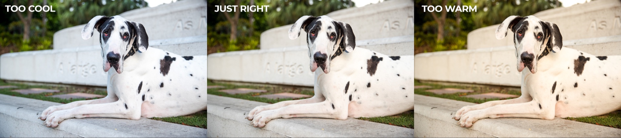
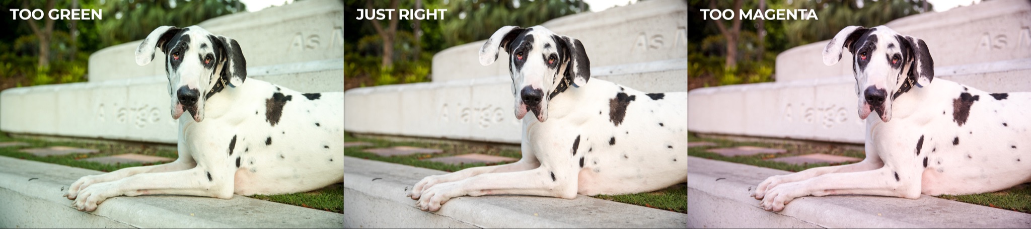
1. White Balance
White balance is one of the trickiest things to master when it comes to editing your images - but it's also one of the most important - as it gives the image a sense of looking "right".
Setting the correct white balance forms a solid foundation for the rest of the edit. If the white balance isn't right, it can often throw your other tone and colour adjustments out as well, and leave you with unwanted colour casts that you need to fix later on.
Having an understanding of natural light can greatly help in your understanding of how to set the correct white balance. Matching the final look of the image to the type of light is important and helps the image to look realistic.
If you find yourself struggling to manually correct the white balance in Lightroom, this is essential reading - 10 Tips for Setting Perfect White Balance.
2. Composition
Composition is the art of arranging elements within a photo to create visual appeal, guide the viewer's eye, add depth, and convey a compelling story.
A simple crop adjustment, even a minor one, can make a world of difference.
You can learn all about the major (and some less often used) rules of composition in this free guide - Unleashing Composition: 14 Fresh Ideas for Creative Pet Photography.
There's also some great examples of common composition and cropping issues in the blog post we're linking to at the bottom of this email.
3. Sharpness (or oversharpening!)
Most professional camera bodies, when paired with quality lenses, deliver sharp images right out of the box - provided they're properly focused and the shutter speed is fast enough to eliminate camera shake and motion blur.
As a general rule, if the subject's eyes are visible in the image, they need to be sharp. Images where the focus point has mistakenly fallen on the nose, or between the eyes, will be marked down.
If sharpening is required, the tools we have at our disposal in editing apps to sharpen our images are awesome, but sometimes the power to sharpen can be abused.
We often see over-sharpened "crunchy" images.
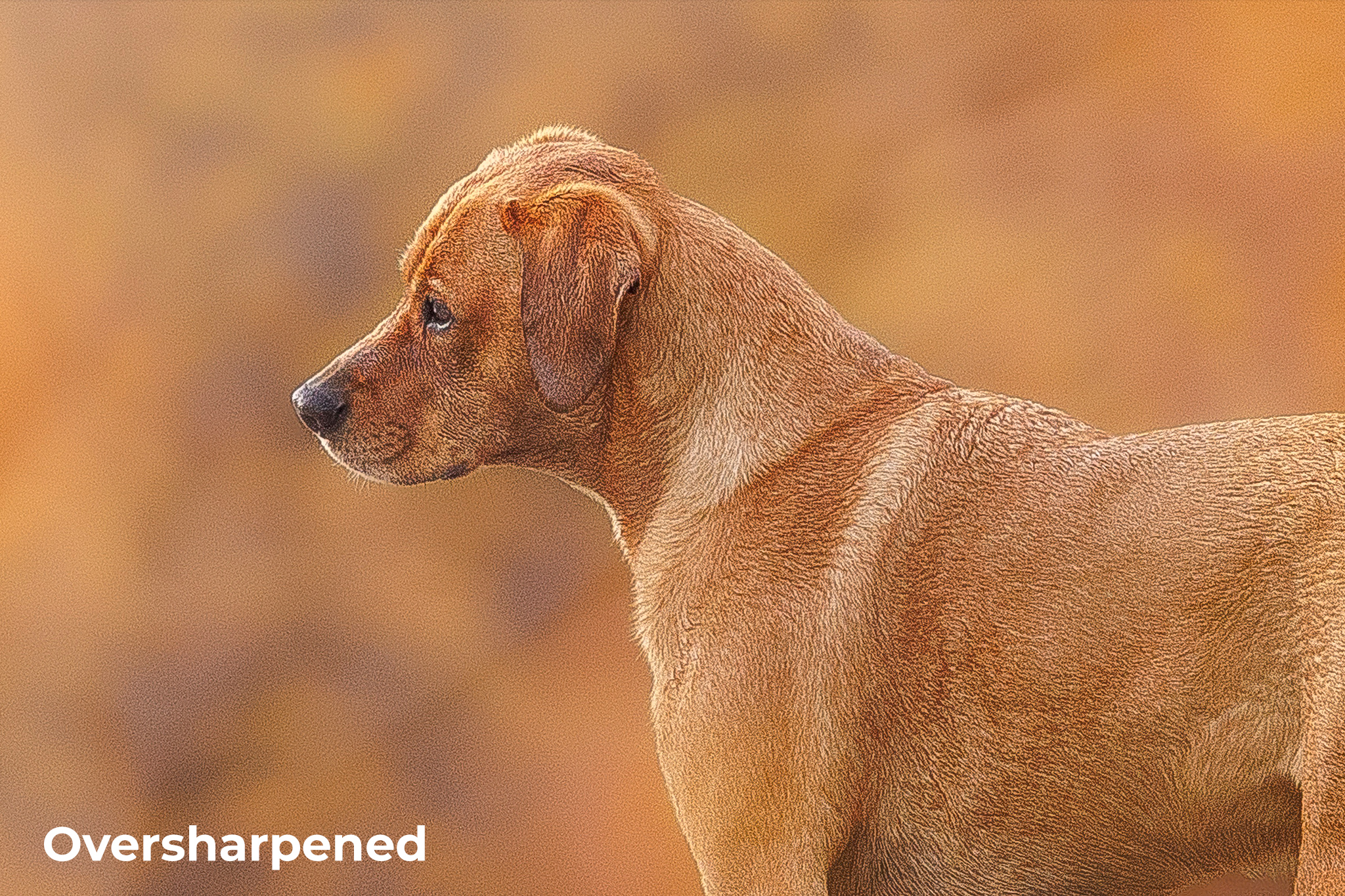
Another common problem arises when background elements that should remain soft are overly sharpened. When applying sharpening, be sure to mask out areas that are meant to stay soft and blurred.
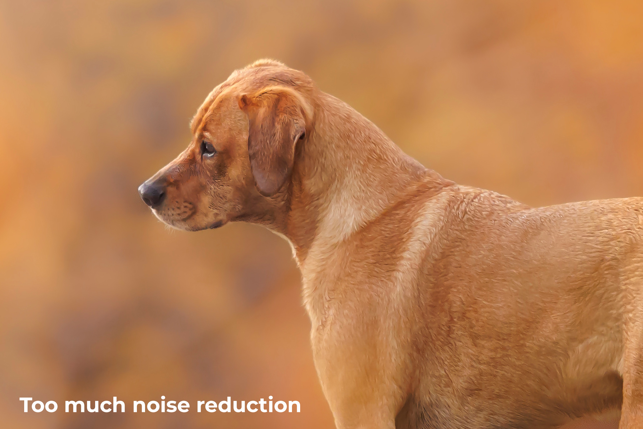
4. Noise (or too much noise reduction!)
Shooting at the high shutter speeds required for freezing the motion of pets often results in high ISOs. Some cameras deal with noise better than others - ISO 1600 with one camera can be super noisy - whereas ISO 1600 with a different (often more expensive) camera body can exhibit very little noise.
Noise can also be introduced to an image in the editing stage, particularly when brightening dark areas.
With recent AI updates to our favourite software, along with dedicated plugins, reducing noise in images is now super easy.
There's simply no excuse for an overly noisy image these days!
However, it's important not to abuse the power! Too much noise reduction can result in the image looking "plastic-like" and losing detail.
5. Straightness
It's safe to say that most photographers rarely shoot perfectly straight.
Regardless of how your RAW images look though, it's easy to straighten them up while you are editing, to avoid that "earth is tilting" look that gives images a very unsettled feel.
If there are buildings, posts, trees or anything that should be vertical - adjust the tilt until they really are vertical. Leaning buildings are just as bad as tilting horizon lines!
Of course, there are always exceptions to the rule - not all images have to be straight - but like all cases of bending the rules, you must have a good reason for doing so.
We have some great tips for straightening your images, with lots of examples, in the blog post we are linking to at the end of this email.
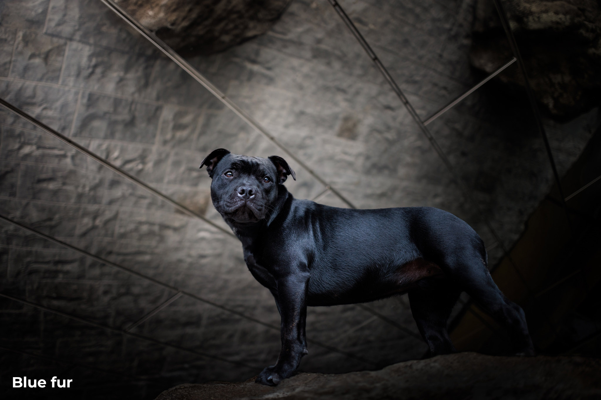
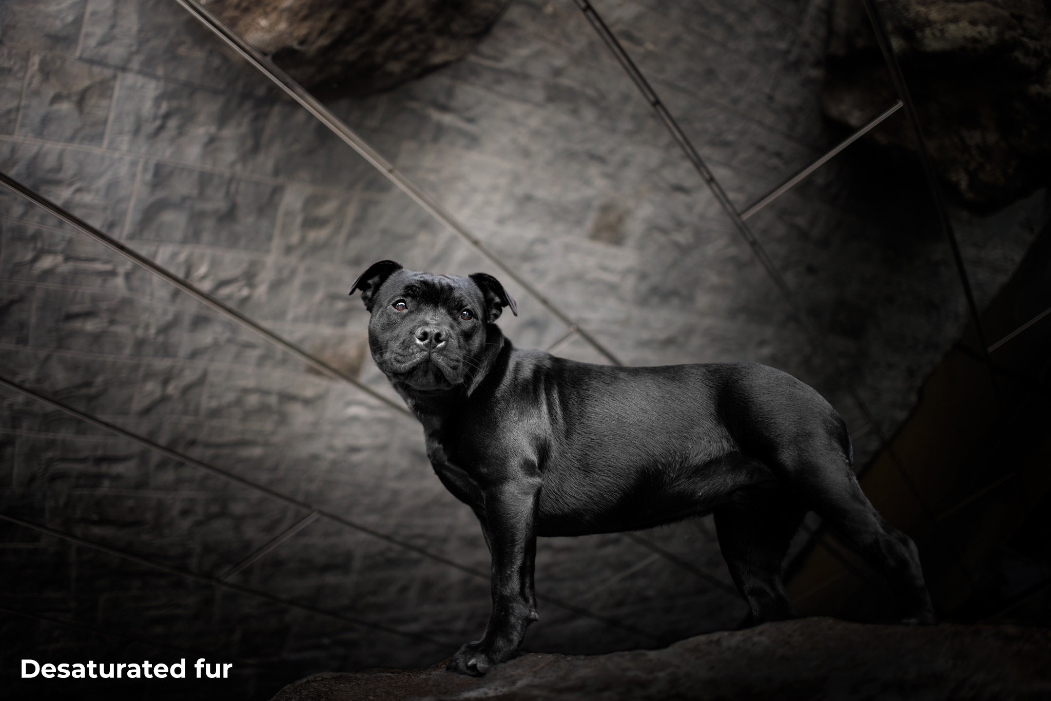
6. Black fur
Black pets can be challenging to photograph, as it's actually the absence of colour in the object that gives the appearance of black. Black objects tend to absorb most of the light, so to see detail in black fur, you really need good lighting.
In fact, photographing black dogs is such a frequently requested topic, we've written an entire article about it here - 10 Essential Tips for Beautiful Black Dogs.
We commonly see two main issues in photos of black dogs.
The first issue is black fur looking "washed out" and greyish - too light and lacking in contrast, and not properly black.
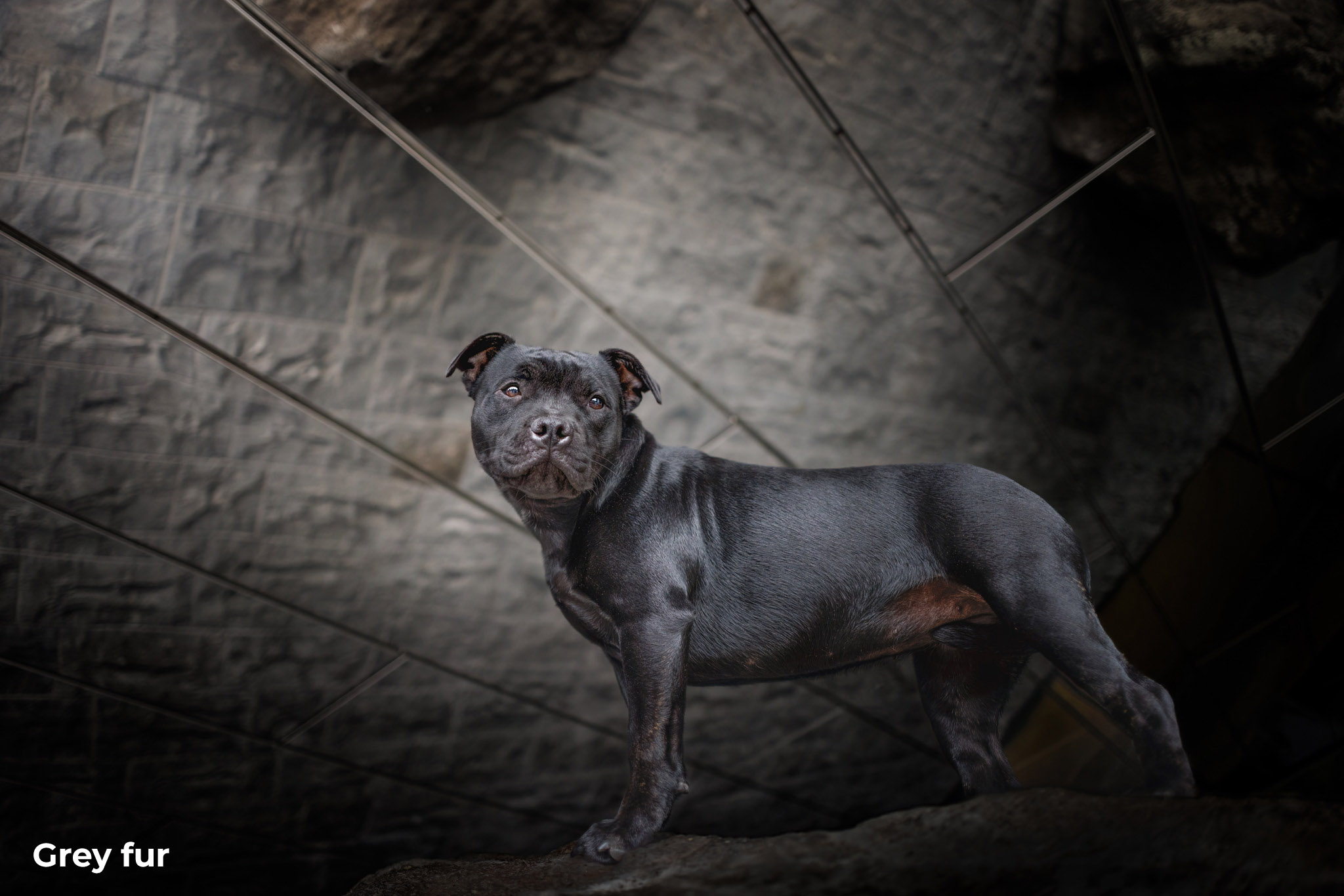
The second and probably most common issue we see is unwanted or distracting colour casts in black fur. This is most often a blue cast if the dog has been photographed in the shade, but can be other colours from the environment like magenta or red.
In an attempt to remove colour casts, we also often see black dogs that have just been desaturated, which pulls ALL the colour out which can also make them too light as they lack the depth that colour gives.
This can also make them look like a black and white pet, in a colour world. Also not a good look!
7. Blown highlights
In most cases, blown highlights, or areas of very bright white with no discernible detail, are not ideal candidates for award-winning images.
Especially when the blown highlights appear on the subject!
Always try to make sure you have not overexposed the brightest areas of the image when shooting.
Assuming you've exposed correctly, it's important not to then lose that detail in those bright areas when you are editing. When adding contrast and enhancing the colours and tones, always keep an eye on those very bright highlights to ensure you can still see detail there.

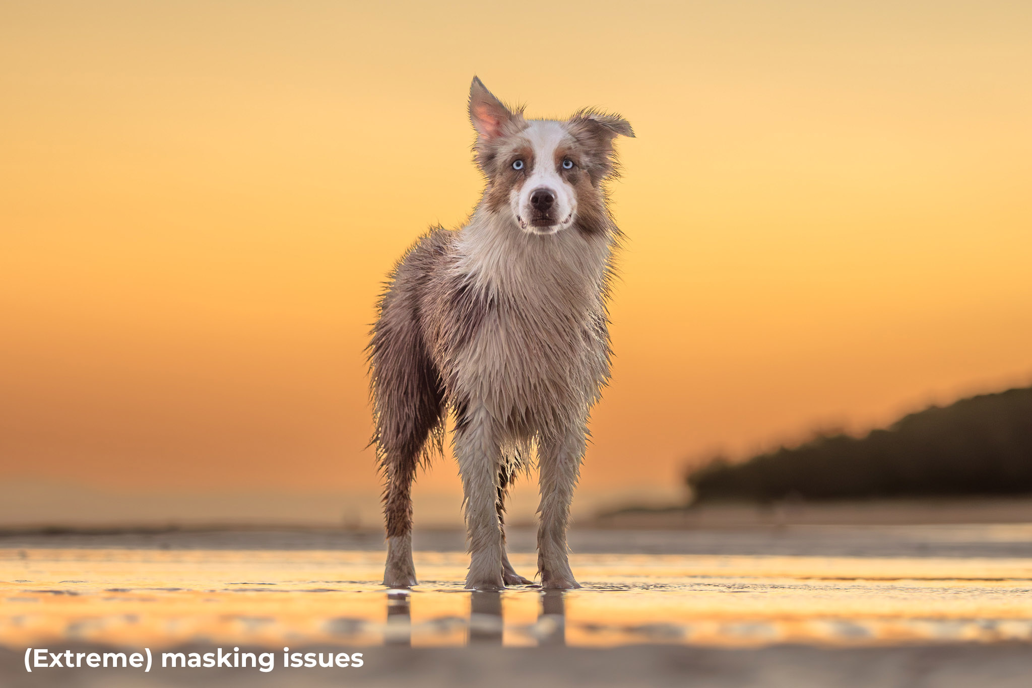
8. Masking issues
The capability to mask and fine-tune specific areas of an image is a relatively recent advancement in our editing toolkit.
However with great power, comes great responsibility!
The AI-powered masking tools are generally fairly accurate, but if you are masking adjoining areas and making large adjustments of exposure and tone, you might end up with fringing on the edges, which is a dead giveaway that masking has been used in a heavy-handed way.
This can be especially obvious when masking fur, and the fluffier your subject, the more obvious it can be.
Issues also arise when performing large shifts in colour, or when reducing clarity or adding blur to a masked area.
9. Attention to detail
If you think of photographers you really admire across all styles and genres, I bet there's one thing that they all do the same.
And that's paying attention to the details.
Much of what makes an image successful is the clarity of its message. Make the main subject and story obvious and remove anything in the image that takes the viewer's attention away from the story.
Basic edits like removing the leash are a given in pet photography, but what else can we do to keep the visual message loud and clear in our images?
The human eye is naturally drawn to bright areas, so if there's anything bright in the background or foreground, it can compete with your subject for the viewer's attention.
If your subject is dark coloured, you have to work even harder to make sure lighter areas of the image aren't distracting.
For awards images, we highly recommend running all your final images through Photoshop (or a similar editing program of your choice), paying special attention to anything distracting that could be detrimental to the image. Depending on the environment, this often means removing quite a lot of visual clutter!
In urban areas you might want to remove:
-
Distracting objects in the background - even if the background is out of focus
-
Brightly coloured objects
-
Bright, blown-out spots and black holes
-
Fallen leaves or weeds from man-made surfaces
-
Unattractive things like lamp poles, street signs, garbage bins, cars
-
Rubbish, cigarette butts
-
Imperfections in buildings - marks, paint chips, missing or damaged bits
-
People and other dogs
In natural areas, distracting elements can include:
-
Stray pieces of grass, twigs and branches, especially if they are on the same plane of focus as the subject, so are very sharp
-
Areas of dead grass or grass clippings can be distracting if most of the grass is green
-
Bright spots or blown-out areas in the background
-
Dead bits of foliage, if they contrast with green or living areas
-
Stray leaves on the ground, if there aren't many other things on the ground
-
Bright sun spots on the ground, making the grass fluro green or yellow, especially if they are also in focus.
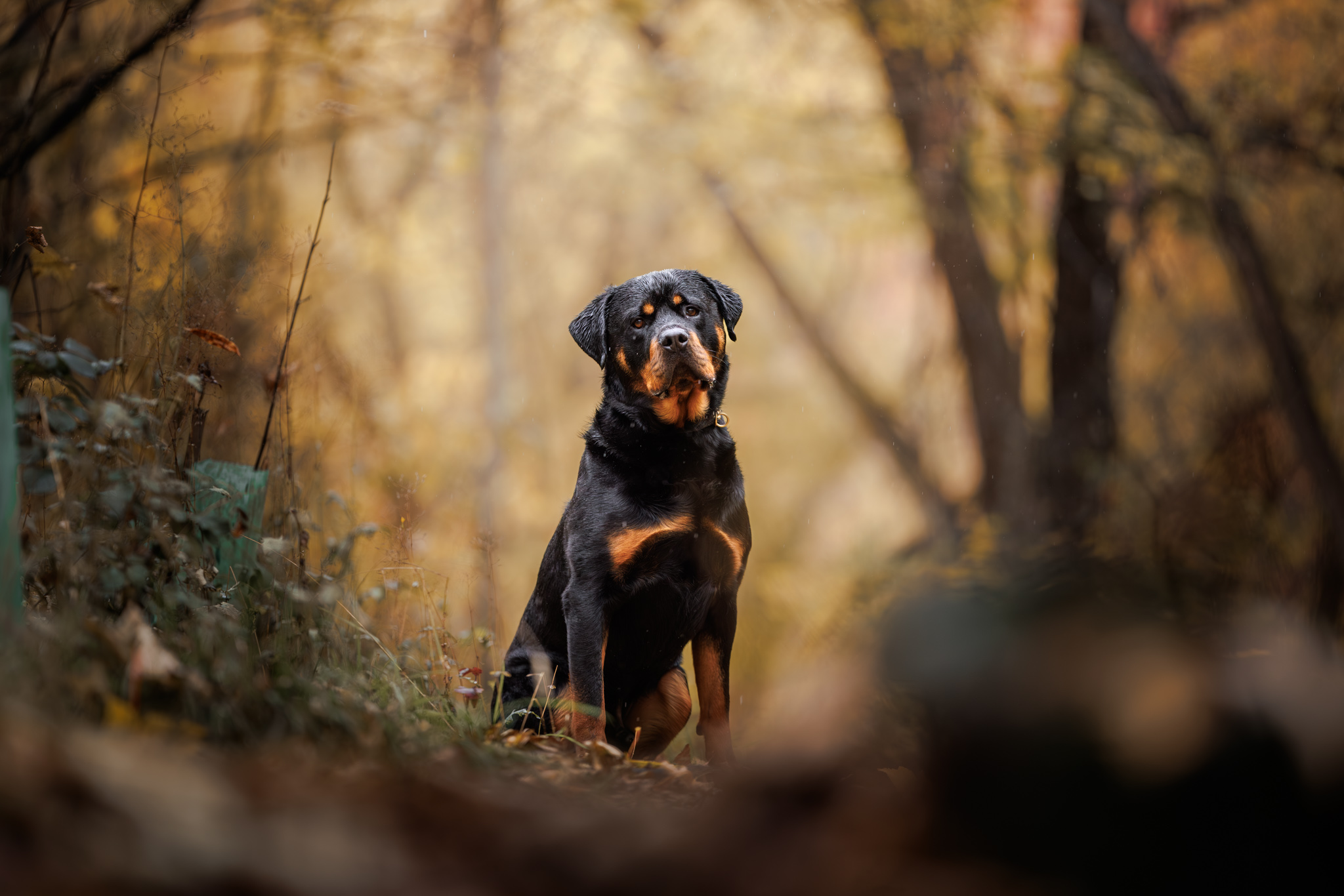
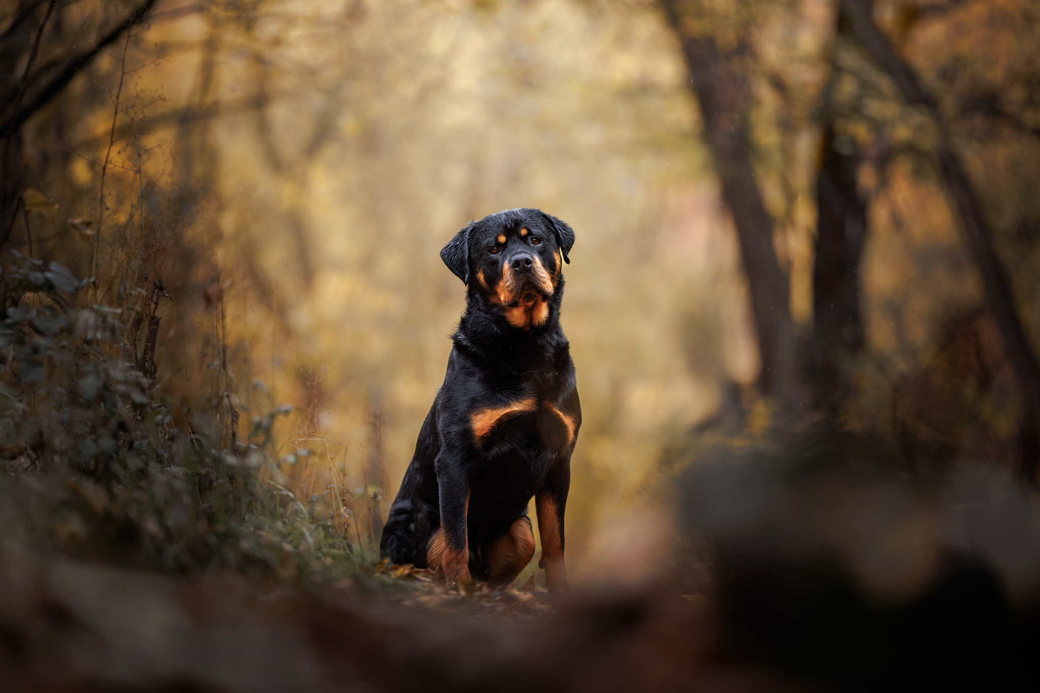
Taking the time to go over your image with a fine tooth comb (i.e. zooming in to 100%) and deal with any distractions is time well spent!
Play "Spot the Difference" between these two images. Do you think the clean-up job has helped improve the image?
10. Eye boogers and spitty tongues!
This also falls into the "attention to detail" category, but is so important it deserves a point all of its own!
Yes, dogs can be kinda gross, and always seem to have eye boogers and slobber - but those things can be really distracting in our images.
It only takes a few seconds to clean up around the eyes, so at a bare minimum this should be something you address with every edit.
Slobbery, spitty tongues and mouths can take a little longer - depending on the extent of the slobber - but this is something worth spending a little extra time on as it makes a huge difference.
On the flip side, sometimes long strings of drool and slobber can be hilarious and should remain. Sometimes, rules are made to be broken!
Further reading and examples: 10 Most Common Pet Photography Editing Mistakes (and how to fix them)
Disclaimer
The editing advice given here is only relevant to images entered in categories other than Documentary. To find out more about allowed editing techniques for the Documentary category, please check the rules.
Join our Mailing List
Want to stay updated with all things IPPA? Get on our list to receive all the inside info!
We hate SPAM. We will never sell your information, for any reason.
